Title Design
Hey everyone we hope you all are having a great day and welcome back to our blog! In today's blog we will be disclosing our title design for the opening sequence.
Font:
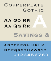
The opening credits of my film will appear in a copperplate font. A copperplate font is very bold, simple, yet in your face all at the same time. This will perfectly fit the movies story as it is a boxing movie which has a lot of in your face action. An example of this font can be shown below.
Contrast: The text will appear in a grey font to accommodate for the multiple backgrounds. We want the contrast to match so using grey will work for when we are in the darker setting. For example the text will appear on a punching bag which is black but grey will still be visible. When we are outside the grey font will still be able to contrast the brighter colors. If grey doesn't work we will move to a white color, the main difficulty is the fact that we are outside and inside for scenes, some darker areas and some lighter. The color will change depending on the color of the background.
Working Title: The title of this film will likely be "Fight Redemption" and it will appear in SOMETHING LIKE THIS.
How will the titles enter and leave the screen?
The titles will fade right on to the screen with no movement and then fading out. It will appear on some objects that are being involved in the scene. For example the text "Directed by" will fade onto the powder that is being used and then fading out. When entering the screen, the name of the workers will be prioritized over the names of the people like this DIRECTED BY: Hunter Pangia
How long will each title be on the screen before it disappears?
The title will appear on the screen for at least two seconds before it disappears. This will help the text settle in to set the tone for the movie. Additionally, there will be multiple texts so we can't have each one on the screen for too long.


Comments
Post a Comment